As more customers begin their search for insurance products on the Internet, it makes sense for insurance brokers and agents to start selling insurance online and to create online quote forms and calculators to attract some of those prospects. With the tools and methods necessary to sell insurance online, insurance brokers and agents can potentially increase their business volume with new customers obtained from Internet sources.
ONLINE QUOTES
There are lots of online insurance brokers and agents selling insurance products online. In the ever increasing competitive world of insurance, where there is little to no differentiation between one provider and another, a key area where online insurance brokers can increase market share is by making quote and application process as intuitive as possible. Unfortunately insurance broker companies still neglect the quotation and application process on their websites and present poorly designed, unintuitive and confusing forms to their prospective customers which in turn could see them missing out on conversions.
Key Takeaways
- Keep the quote form simple and only ask relevant questions
- Do not ask for personal information during the initial quotation process
- Don’t assume your users know your products
- Provide tools or calculators to guide users when completing the form
- Provide useful contextual help during the quote process
- Ensure the form layout is intuitive and appealing
How insurance companies who sell their products online can consider implementing changes on their website?
- Effectiveness: Measure whether users could successfully complete the quote process and answer all questions without making any errors
- Efficiency: Measure the time it takes to complete the quote process, the number of questions asked and the number of steps involved
- Satisfaction: Measure users perception of the effort it took to complete the quote process and how easy or difficult it felt
Here are 6 key learning points that insurance brokers who want to sell online can use to ensure that they are offering the best experience to their potential customers.
1. Keep the quote form simple and only ask relevant questions
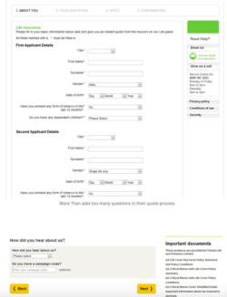
Most online insurance brokers are adding extra fields that were not required for a quote. This tended to increase the time to complete the task and introduce more potential for errors and abandonment. For a quote, name and address details are not required. Equally asking users how they “heard about you” at this stage in the process just adds to the frustration, and rarely gets completed honestly by users just wanting a quote. Questions not required for the quote, such as personal details could be asked later during the application process once users have decided to proceed.
2. Do not ask for personal information during the initial quotation process
On insurance websites, one of the main frustrations users complain of is having to provide personal details in order to receive a quote. Most have concerns about giving their phone number or email address in fear of receiving unsolicited emails and phone calls. This is a significant barrier to conversion which sees them abandoning the quote process in search of another provider who doesn’t require personal information before they get a quote.
Online insurance brokers would increase their conversion rate by removing fields that ask for personal information from the quote form. Users will be more inclined to give their email address willingly once they are shown a quote price if they are offered to have the quote emailed to them.
3. Don’t assume your users know your products
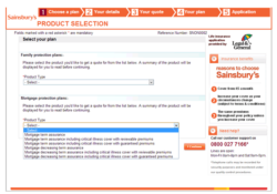
Many online brokers assume users had read and understood the specific insurance products conditions and had already made a decision which insurance is best for them. In reality most users will jump straight to get a quote before reading any contents on the website and would be unsure when they are required to select a suitable product from the list.
If users are required to know certain information about the products before the quotation process, make them aware of this fact before they begin the process. Better still would be to offer help during the quotation process that explains the options available to them.
4. Provide tools or calculators to guide users when completing the form
The websites that offered a better experience offered tools and calculators during the quotation process that would guide the user when answering questions. For example some users that are taking life cover would not understand some important aspects, such as the amount of cover they would need and would have concerns that they were either under-insured or unnecessarily paying more in premiums.
5. Provide useful contextual help during the quote process
Quote forms must provide some form of help tool tips. This help should be displayed automatically when users click into the specific field and should provide additional information about what is required and more importantly why it’s required. Where further explanation is needed the tool tip should provide a link to further information.
6. Ensure the form layout is intuitive and appealing
Most people don’t enjoy spending time filling out insurance forms and want to get it over with as quickly as possible. Some of the websites are displaying difficult-to-use and complex forms; with long text heavy questions and poor design with misaligned fields, which would lead to frustrated users who are more likely to abandon the form.
However form layout and design doesn’t have to be boring or dull. Find creative ways of gathering information to make applying for a quote enjoyable.
LEADS TO YOUR WEBSITE
Now when you have a really good website for selling online, you will need to generate leads. These could be visitors who sign up to your e-mail marketing list, or visitors who you convert into customers in the moment.
According to Eisenberg Holdings, companies typically spend $92 to bring a customer to their site, but only $1 to convert them. Therefore it should be no surprise that conversion rates typically range from a mere 1 to 3 percent, according to research conducted by Steelhouse. In other words, 97 percent of the people who come to your agency’s website leave without requesting a quote. If you invested 10 or even 25 percent of your efforts on conversion, instead of just 1 percent, you could heavily impact the leads you generate from your website.
Here are some tried and trusted ways to improve your lead generation efforts that you can start to experiment with to boost your conversions.
Optimise your landing pages
First of all, you need an optimized landing page. That means one that is optimized for conversions, and there are many specialist tips that a professional can help you with, including:
- focus on only one goal (an email sign up, product purchase, etc.);
- don’t include any links to anywhere else;
- make your CTA stand out using color and design;
- state exactly what will happen when prospects click on the CTA (never just say ‘Click Here’ or ‘Submit’);
- make sure the landing page follows on from where the customer arrived from, such as an email, PPC ad, etc. There should be continuity;
- always use social proof, which could come in the form of testimonials or social media counters;
- test your headline, CTA, testimonials and anything else until you increase conversions.
Use social media
Many businesses fail to think of social media as a lead-generation tool, but it can actually be very powerful.
One way to do this is to entice your Twitter followers to visit your website to read content, and then encourage them to sign up to your email list. Alternatively, you can sign them up to your list directly from Twitter. This way you are not selling directly, but you are generating leads.
Use content marketing
Content marketing is a form of inbound marketing where the idea is to publish high-quality content in order to encourage shares and build links. When it comes to lead-generation ideas, this should definitely be one of the ones you focus on.
Start by publishing content on your blog, then move onto guest posts. Encourage shares of your content on social media, and the more shares and links you get, the more people will find your site. It will also help your SEO, which will help direct more targeted visitors to your site.
Use dedicated lead-generation pop-ups
Some people love pop-ups, some hate them. However, if used correctly, they can be very effective for lead generation.
You could set up a pop-up that asks people to sign up to your email list when they have been on your website for a short period of time, and this may prove to be effective.
You could also consider using a tool like Social Locker for Word Press. Using this, you can set the popup to appear once a visitor has landed on your page and has read some of the content.
You can then ask for a Facebook Like or a Tweet to continue reading. After the visitor is engaged, they are already enjoying your content, and they may be more likely to oblige. This can help to get more shares, and eventually more leads.
Provide something in return for emails
If you are building your email list, don’t assume that people will give away their emails for nothing. You want to get access to your targets’ inboxes, and they will want something in return.
Just because what you are providing is free, you must still make sure it provides value if you want to get more leads, so make sure you come up with a good offer.
Boost your leads, boost your conversions
So start to focus on hitting your lead generation targets using these techniques, and you could soon start to see more sales.
Source: experienceux.co.uk, Jason Hulott LinkedIn, InsuranceAgents.com
INSLY is suitable software for selling insurance products online via API service. Please contact us by e-mail and let’s discuss in a 15-minutes call the possibilities for your successful online business.
READ ALSO:
Customer Story: Ptarmigan’s new insurance trading platform launched
How MGAs are positioned to innovate in the insurance market?


